
Heim >Web-Frontend >js-Tutorial >Ein beeindruckendes animiertes Navigationsmenü basierend auf jquery, das auf Klickereignisse_jquery reagieren kann
Ein beeindruckendes animiertes Navigationsmenü basierend auf jquery, das auf Klickereignisse_jquery reagieren kann

- WBOYWBOYWBOYWBOYWBOYWBOYWBOYWBOYWBOYWBOYWBOYWBOYWBOriginal
- 2016-05-16 16:32:221387Durchsuche
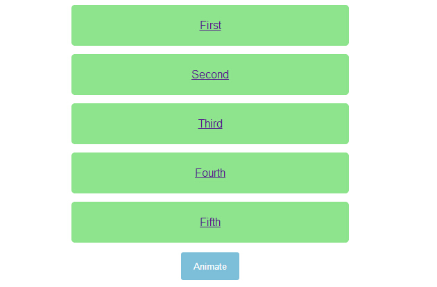
Heute werde ich ein atemberaubendes animiertes Navigationsmenü basierend auf JQuery mit Ihnen teilen. Dieses Navigationsmenü verfügt zunächst über eine Schaltfläche in der Mitte der Seite. Klicken Sie auf die Schaltfläche, und das Menü wird von links in die Seite verschoben. Klicken Sie erneut auf die Schaltfläche und die Navigation fliegt in die Nachricht auf der linken Seite. Der Animationseffekt ist sehr cool. Werfen wir einen Blick auf die Renderings:
HTML-Code:
<ul>
<li><a href="http://www.w2bc.com">First</a></li>
<li><a href="http://www.w2bc.com">Second</a></li>
<li><a href="http://www.w2bc.com">Third</a></li>
<li><a href="http://www.w2bc.com">Fourth</a></li>
<li><a href="http://www.w2bc.com">Fifth</a></li>
</ul>
<button>
Animate</button>
<script src='jquery.js'></script>
<script> $('button').on('click', function () {
$('ul').toggleClass('animate');
}); //@ sourceURL=pen.js
</script>
CSS-Code:
body
{
text-align: center;
}

ul
{
width: 400px;
padding: 0;
margin: 0 auto;
}
ul.animate li
{
transform: translate(0);
}
ul.animate li:nth-of-type(1)
{
transition-delay: 0.05s;
}
ul.animate li:nth-of-type(2)
{
transition-delay: 0.1s;
}
ul.animate li:nth-of-type(3)
{
transition-delay: 0.15s;
}
ul.animate li:nth-of-type(4)
{
transition-delay: 0.2s;
}
ul.animate li:nth-of-type(5)
{
transition-delay: 0.25s;
}

li
{
list-style: none;
display: block;
padding: 20px;
margin: 12px 0;
border-radius: 5px;
font-family: Helvetica, sans-serif;
color: #fff;
background: #8DE48D;
transform: translate(-500%);
transition: transform 0.75s cubic-bezier(0.175, 0.885, 0.32, 1.08);
}
li:nth-of-type(5)
{
transition-delay: 0.15s;
}
li:nth-of-type(4)
{
transition-delay: 0.3s;
}
li:nth-of-type(3)
{
transition-delay: 0.45s;
}
li:nth-of-type(2)
{
transition-delay: 0.6s;
}
li:nth-of-type(1)
{
transition-delay: 0.75s;
}

button
{
padding: 12px 18px;
border: none;
border-radius: 3px;
color: #fff;
background: #7DBED8;
}
button:focus
{
outline: none;
}
Stellungnahme:
Der Inhalt dieses Artikels wird freiwillig von Internetnutzern beigesteuert und das Urheberrecht liegt beim ursprünglichen Autor. Diese Website übernimmt keine entsprechende rechtliche Verantwortung. Wenn Sie Inhalte finden, bei denen der Verdacht eines Plagiats oder einer Rechtsverletzung besteht, wenden Sie sich bitte an admin@php.cn
Vorheriger Artikel:Vergleich verschiedener Beispiele für Ajax und Nachbearbeitung von JSON in jQuery_jqueryNächster Artikel:Vergleich verschiedener Beispiele für Ajax und Nachbearbeitung von JSON in jQuery_jquery
In Verbindung stehende Artikel
Mehr sehen- Eine eingehende Analyse der Bootstrap-Listengruppenkomponente
- Detaillierte Erläuterung des JavaScript-Funktions-Curryings
- Vollständiges Beispiel für die Generierung von JS-Passwörtern und die Erkennung der Stärke (mit Download des Demo-Quellcodes)
- Angularjs integriert WeChat UI (weui)
- Wie man mit JavaScript schnell zwischen traditionellem Chinesisch und vereinfachtem Chinesisch wechselt und wie Websites den Wechsel zwischen vereinfachtem und traditionellem Chinesisch unterstützen – Javascript-Kenntnisse