
以下将展示微信小程序之视图容器page-container源码官方组件能力,组件样式仅供参考,开发者可根据自身需求定义组件样式,具体属性参数详见小程序开发文档。
功能描述:
页面容器。
小程序如果在页面内进行复杂的界面设计(如在页面内弹出半屏的弹窗、在页面内加载一个全屏的子页面等),用户进行返回操作会直接离开当前页面,不符合用户预期,预期应为关闭当前弹出的组件。 为此提供“假页”容器组件,效果类似于 popup 弹出层,页面内存在该容器时,当用户进行返回操作,关闭该容器不关闭页面。返回操作包括三种情形,右滑手势、安卓物理返回键和调用 navigateBack 接口。
属性说明: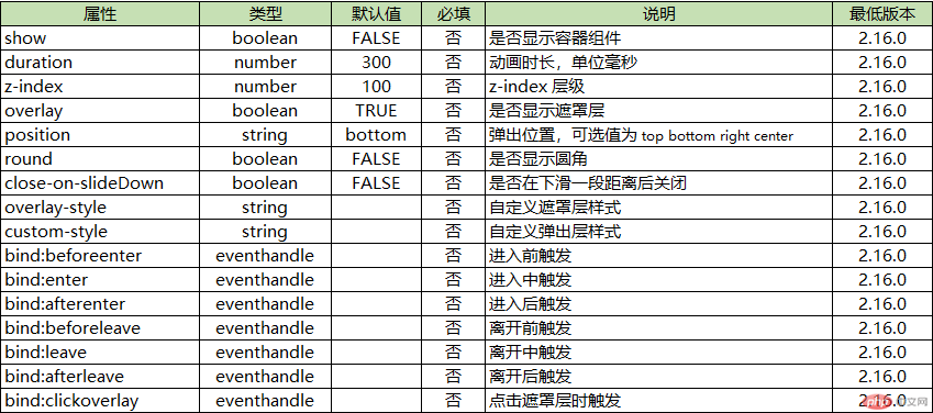
Bug & Tip:
1.tip: 当前页面最多只有 1 个容器,若已存在容器的情况下,无法增加新的容器
2.tip: wx.navigateBack 无法在页面栈顶调用,此时没有上一级页面
示例代码:
WXML:
<view class="title">弹出位置</view><view class="box"><button class="btn" bindtap="popup" data-position="right">右侧弹出</button><button class="btn" bindtap="popup" data-position="top">顶部弹出</button><button class="btn" bindtap="popup" data-position="bottom">底部弹出</button><button class="btn" bindtap="popup" data-position="center">中央弹出</button></view><view class="title">弹窗圆角</view><view class="box"><button class="btn" bindtap="changeRound">设置{{round ? '直角' : '圆角'}}</button></view><view class="title">遮罩层</view><view class="box"><button class="btn" bindtap="changeOverlay">设置{{overlay ? '无' : '有'}}遮罩</button><button class="btn" bindtap="changeOverlayStyle" data-type="black">黑色半透明遮罩</button><button class="btn" bindtap="changeOverlayStyle" data-type="white">白色半透明遮罩</button><button class="btn" bindtap="changeOverlayStyle" data-type="blur">模糊遮罩</button></view><page-containershow="{{show}}"round="{{round}}"overlay="{{overlay}}"duration="{{duration}}"position="{{position}}"close-on-slide-down="{{false}}"bindbeforeenter="onBeforeEnter"bindenter="onEnter"bindafterenter="onAfterEnter"bindbeforeleave="onBeforeLeave"bindleave="onLeave"bindafterleave="onAfterLeave"bindclickoverlay="onClickOverlay"custom-style="{{customStyle}}"overlay-style="{{overlayStyle}}"><view class="detail-page"><button type="primary" bindtap="exit">推出</button></view></page-container>
WXSS:
page {background-color: #f7f8fa;color: #323232;width: 100%;height: 100%;}.box {margin: 0 12px;}.title {margin: 0;padding: 32px 16px 16px;color: rgba(69, 90, 100, 0.6);font-weight: normal;font-size: 18px;line-height: 20px;text-align: center;}.btn {display: block;width: 100%;margin: 10px 0;background-color: #fff;}.detail-page {width: 100%;height: 100%;min-height: 300px;display: flex;align-items: center;justify-content: center;}
版权声明: 本站所有内容均由互联网收集整理、上传,如涉及版权问题,我们第一时间处理。
原文链接地址:
https://developers.weixin.qq.com/miniprogram/dev/component/page-container.html