
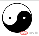
![]() 一、效果图
一、效果图
![]() 二、思路
二、思路
通过border-radius: 50%来实现container画圆
通过伪代码before中以left和top、after中以right和top定位到对应圆心进行二次画圆及涂色即可实现
![]() 三、源代码
三、源代码
<!DOCTYPE html><html lang="en"><head> <meta charset="UTF-8"> <title>太极图</title> <style> .container{ width: 96px; height: 48px; border-radius: 50%; border: 2px solid #000; margin: 0 auto; position: absolute; border-bottom: 50px solid #000; } div:before{ content: ""; position: absolute; left: 0;top: 50%; width: 8px; height: 8px; background: #000; border: 20px solid #fff; border-radius: 50%; } div:after{ content: ""; position: absolute; right: 0; top: 50%; width: 8px; height: 8px; background: #fff; border: 20px solid #000; border-radius: 50%; } </style></head><body> <div class="container"></div></body></html>