

— flex 布局 属于弹性布局
- flex 有主轴 和交叉轴和剩余空间的变换,可以随时可以让字元素以设置宽度来进行缩小和放大或者自适应
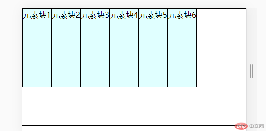
- 图例:
-代码区
*{box-sizing: border-box;margin: 0;padding: 0;}.container{display: flex;width: 40rem;height: 15em;border: 1px solid #000;/*主轴变横向*//* flex-direction: column; *//*换行显示*//* flex-flow: row wrap; *//*剩余空间位于所有项目的左边*//* justify-content: flex-start;/*剩余空间位于所有项目的右边*//*justify-content:flex-end;/*剩余空间位于所有项目的中边*//* justify-content: center;/*剩余空间两端对齐*//*justify-content: space-between;/*剩余空间分散对齐*//*justify-content: space-around;/*剩余空间平均对齐*//*justify-content: space-evenly;/*交叉轴对齐:交叉轴剩余空间*//*align-items: stretch;*//* align-items: flex-start; *//* align-items: flex-end; *//* align-items:center; */}.container > .itm{height: 10em;background-color: lightcyan;border: 1px solid #000;}.container {/* flex-direction: row nowrap; *//* flex-wrap: nowrap;*//* flex-direction: row; *//* align-items:flex-start; *//*flex-direction:row-reverse;*//* flex-direction:column-reverse; */}
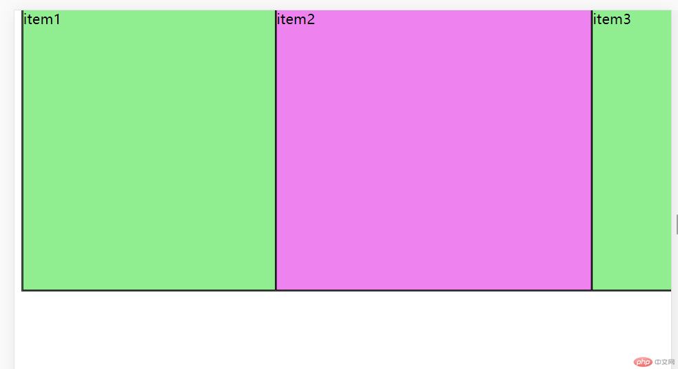
— flex 属性 (允许放大,允许缩小,宽度自动)
图例
代码区
<!DOCTYPE html><html lang="en"><head><meta charset="UTF-8"><meta http-equiv="X-UA-Compatible" content="IE=edge"><meta name="viewport" content="width=device-width, initial-scale=1.0"><title>Document</title><style> .container{height:20rem;border: 1px solid;display: flex;}.container > .item {width: 20rem;background-color: lightcyan;border: 1px solid;/*项目的计算尺寸,优先级大于width */flex-basis: 25rem;/*禁止收缩*//* flex-shrink: 1;/* 默认允许收缩 *//*flex-grow:1;flex-grow: 0; *//*flex默认:禁止放大,允许收缩,宽度自动*//* flex: 0 1 auto; *//*flex 允许放大 允许缩小 宽度自动*//*flex: 1 0 auto;*//*单值语法*//* flex: 1; */}.container > .item:first-of-type, .container > .item:last-of-type{background-color: lightgreen;flex: 0 1 auto;}.container > .item.two{background-color: violet;align-self: center;align-self:stretch;}</style></head><body><div class="container"><div class="item">item1</div><div class="item two">item2</div><div class="item">item3</div><!-- <div class="item">item4</div> --></div></body></html>