
项目在网格单元和容器中对齐方式
<!DOCTYPE html><html lang="en"><head><meta charset="UTF-8"><meta name="viewport" content="width=device-width, initial-scale=1.0"><meta http-equiv="X-UA-Compatible" content="ie=edge"><title>项目在网格单元和容器中对齐方式</title><style>.main{width: 500px;height: 500px;margin: 0 auto;background-color: cornsilk;display: grid;grid-template-columns: 1fr 1fr 1fr;grid-template-rows: 10em;grid-auto-rows: 10em;gap: 1em;}.div{width: 3em;height: 3em;background-color: rgb(187, 247, 202);line-height: 3em;text-align: center;}/* 注:只有项目在网络单元中存在剩余空间的时候,对齐才有必要且有意义 *//* 1. 设置容器中的“所有项目”在网格单元中的对齐方式 */.main{/* place-items: 第一个值垂直方向 第二个值水平方向; *//* 垂直水平都居中 */place-items:center center;/* 垂直居上,水平居中 *//* place-items: start center; *//* 拉伸,取消项目的固定尺寸才可以看到效果 *//* place-items: stretch; */}.main{/* 只有所有项目在容器中存在剩余空间时对齐才有必要且有意义 *//* 1. 将所有项目做为一个整体在容器中对齐 *//* place-content: center center; */place-content: center;/*2. 将所有项目打散成独立个体在容器中设置对齐方式 *//* 二端对齐 *//* place-content: space-between space-between; *//* 简写 */place-content: space-between;place-content: space-around space-evenly;}/* 2. 设置容器中的“某一个项目”在网格单元中的对齐方式 *//* 这个属性必须用在项目上: place-self */.main>.div:nth-of-type(2){background-color: chartreuse;/* 居中 */place-self: center center;/* 左下 */place-self: end start;/* 右下 */place-self: end;/* 与place-self: end;相同 */place-self: end end;}</style></head><body><div class="main"><div class="div">1</div><div class="div">2</div><div class="div">3</div><div class="div">4</div><div class="div">5</div><div class="div">6</div></div></body></html>
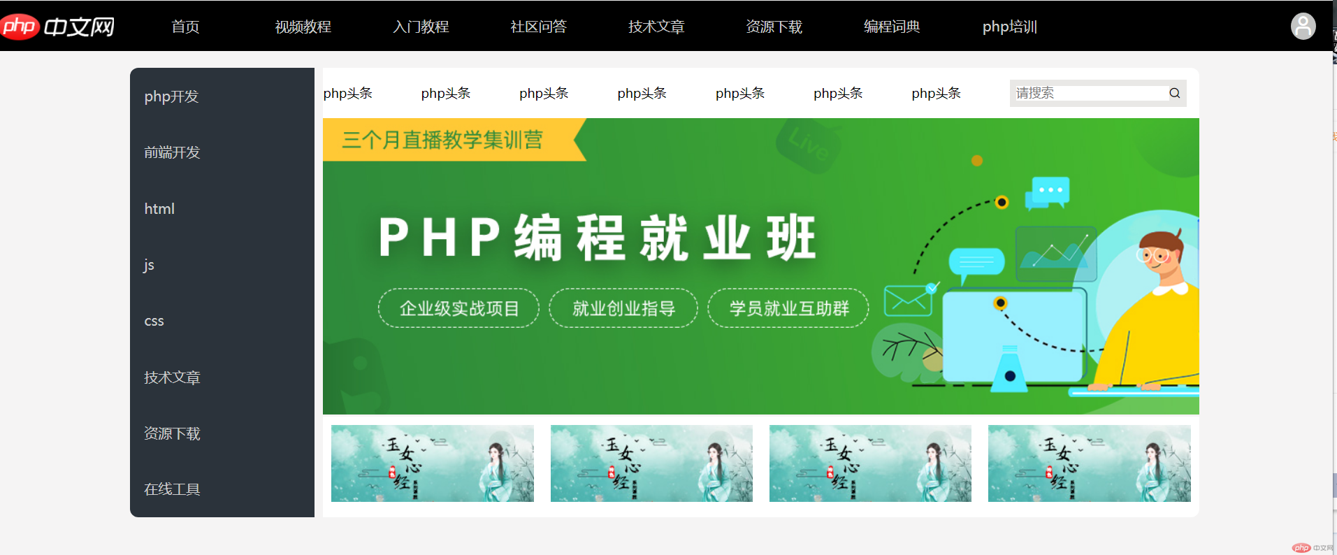
仿php.cn页面
*{margin: 0;padding: 0;box-sizing: border-box;}html{font-size: 10px;background-color: rgb(245, 244, 244);}@media screen and (max-width: 1200px) {html {font-size: 16px;min-width: 1200px;}}@media screen and (max-width: 1400px) {html {font-size: 8px;min-width: 1200px;}}a{color: #cccccc;text-decoration: none;}a:hover{color: red;}ul li{display: inline-block;}header{min-height: 6em;background-color: #000;display: grid;grid-template-columns: 14em 1fr 30em;grid-template-rows: 6em;margin-bottom: 2em;}header>div:first-of-type{background-image: url('phpcn.png');}header>div:nth-of-type(2) ul{display: grid;grid-template-columns: repeat(8,1fr);grid-template-rows: 6em;gap: 1em;text-align: center;line-height: 6em;padding: 0 2em;}header>div:nth-of-type(2) ul li{font-size: 2rem;font-weight: 500;}header>div:nth-of-type(2) ul li a:hover{display: inline-block;width: 100%;height: 100%;color: #ffffff;border-bottom:5px solid seagreen;}header>div:last-of-type{display: flex;justify-content: flex-end;padding-right: 2em;align-items: center;}header>div:last-of-type .iconfont{color: white;font-size: 3rem;background-color: rgb(195, 196, 195);padding: 0.1em;border-radius: 50%;}header>div:last-of-type .iconfont:hover{color: yellow;}.container{width: 80%;margin: 0 auto;border-radius: 1em;display: grid;grid-template-columns: 22em 1fr;gap: 1em;}.container>aside{background: #2b333b;border-radius: 1em 0 0 1em;}.container>aside>ul{min-height: 100%;display: grid;grid-template-columns: 1fr;place-content: space-around space-evenly;}.container>aside>ul li{height: 3em;font-size: 2rem;padding-left: 1em;line-height: 3em;}.container>aside>ul li:hover{background-color: rgba(247, 243, 243, 0.2);}.container>main{display: grid;grid-template-columns: 1fr;grid-template-rows: 6em 1fr 12em;}.container>main>ul{background-color: #ffffff;border-radius: 0 1em 0 0;display: flex;align-items: center;justify-content: space-between;}.container>main>ul>li{font-size: 1.8rem;}.container>main>ul>li>a{color: black;}.container>main>ul>li:last-of-type{background-color: rgb(233, 232, 230);padding: 0.5em 0.5em;display: flex;align-items: center;margin-right: 1em;}.container>main>ul>li:last-of-type input{border: none;font-size: 1.8rem;}.container>main>div:first-of-type img{width: 100%;}.container>main>div:last-of-type{display: grid;grid-template-columns: 1fr 1fr 1fr 1fr;background-color: #ffffff;border-radius: 0 0 1em 0;}.container>main>div:last-of-type img{width: 100%;padding: 1em;}