
浮动元素高度塌陷产生的原因与解决方案
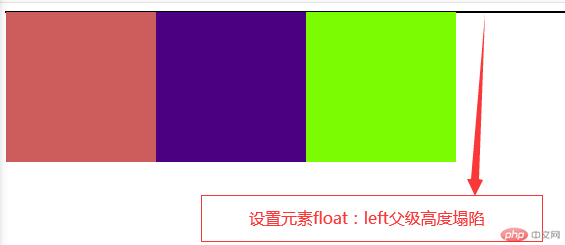
在使用CSS编写网页的过程中,我们经常会遇到一种情况,给元素设置浮动之后float:left/right,当父元素没定义高,高度由子元素撑开。所有子元素都浮动后,父元素失去高了,这就是高度塌陷。
例:
<!DOCTYPE html><html lang="en"><head><meta charset="UTF-8"><meta name="viewport" content="width=device-width, initial-scale=1.0"><title>浮动元素高度塌陷产生的原因</title></head><body><style>.container{border: 1px solid #000;}.item{width: 150px;height: 150px;float: left;}.item:nth-child(1){background-color: indianred;}.item:nth-child(2){background-color: indigo;}.item:nth-child(3){background-color: lawngreen;}</style></body><div class="container"><div class="item"></div><div class="item"></div><div class="item"></div></div></html>
- 例效果图
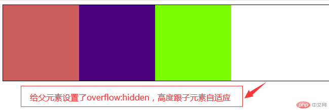
解决方案
overflow:hidden
隐藏溢出,当内容超过其父元素时,可以使用该属性和值将溢出的部分裁剪掉,使页面更加美观
- 清除浮动,当子元素浮动时,给父元素添加overflow:hidden,按照它的第一个特性,应该将子元素超出的部分截掉,但是因为子元素有浮动,无法裁剪,所有只能由父元素增加高度去包裹住子元素,使得父元素拥有了高度,而这个高度是跟随子元素自适应的高度,这样就把浮动的子元素包含在父元素内。
-实例:
.container{border: 1px solid #000;overflow: hidden;}
- 效果图
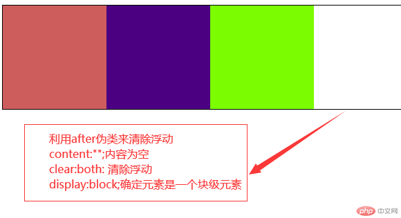
.container::after{content: "";clear:both; /*清除浮动*/display:block;}
- 效果图
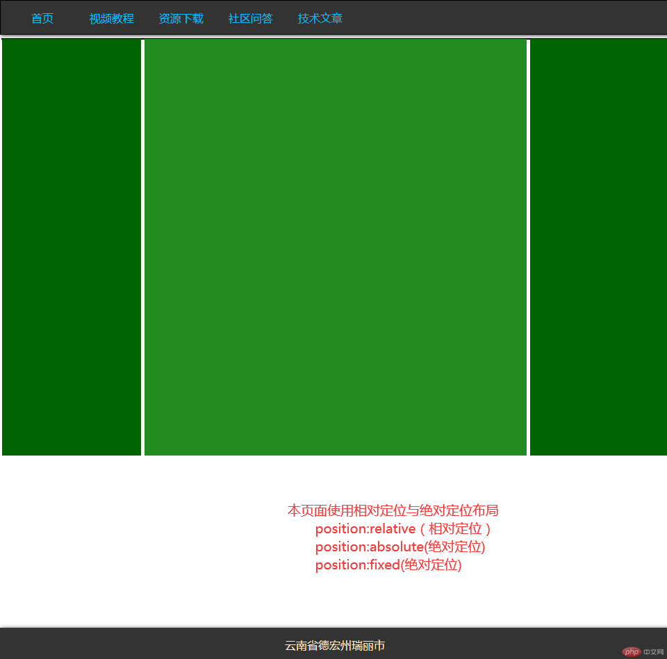
使用定位与浮动完成一个三列经典布局
<!DOCTYPE html><html lang="en"><head><meta charset="UTF-8" /><meta name="viewport" content="width=device-width, initial-scale=1.0" /><title>定位与浮动三列经典布局</title></head><style>* {margin: 0;padding: 0;box-sizing: border-box;}/* ↑初始化↑ */a {text-decoration: none;color: deepskyblue;}a:hover {color: tomato;}/* 设置网页超链接的字体样式 */.header {width: 100%;height: 50px;border: 1px solid #000;background-color: #333;line-height: 50px;box-shadow: 1px 1px 5px #333333; /* 设置header阴影 */}.header > ul > li {list-style: none;float: left; /*导航栏浮动 */margin-left: 20px;width: 80px;text-align: center;}.header > ul > li a:hover {background-color: rgb(0, 136, 45);display: block;color: snow;}/* 设置网页头的样式 */.container {width: 960px;border: 1px solid #000;margin: 5px auto;position: relative;}.container > .left {width: 200px;min-height: 600px;background-color: darkgreen;position: absolute; /*定位元素为父级元素 */top: 0;left: 0;}.container > .main {width: 550px;min-height: 600px;background-color: forestgreen;position: absolute; /*绝对定位 */top: 0;left: 200px;margin-left: 5px;}.container > .right {width: 200px;min-height: 600px;background-color: darkgreen;margin-left: 10px;position: absolute; /*绝对定位 */top: 0;left: 750px;}.footer {width: 100%;height: 50;position: fixed; /*对网页底部绝对定位 */bottom: 0;left: 0;background-color: #333;line-height: 50px;box-shadow: 1px 1px 5px #333333; /* 设置header阴影 */text-align: center;color: blanchedalmond;}</style><body><div class="header"><ul><li><a href="">首页</a></li><li><a href="">视频教程</a></li><li><a href="">资源下载</a></li><li><a href="">社区问答</a></li><li><a href="">技术文章</a></li></ul></div><div class="container"><div class="left"></div><div class="main"></div><div class="right"></div></div><div class="footer">云南省德宏州瑞丽市</div></body></html>
实例效果图