
实列演示代码:
<!DOCTYPE html><html lang="en"><head><meta charset="UTF-8" /><meta name="viewport" content="width=device-width, initial-scale=1.0" /><title>Document</title><style>body {height: 2000px;/* 网站整体传个背景图 */background-image: url(images/t018b071039ea200dc7.jpg);background-repeat: no-repeat;}/* 设置一个框,margin设置margin:auto使它在页面居中 */.nei {width: 1200px;height: 800px;margin: auto;border: 5px solid;}.nei1 {width: 200px;height: 200px;background-color: rgb(15, 226, 86);border: 1px solid;margin-top: 20px;padding-top: 10px;float: right;/* 相对定位,配合top,left,right,bottom使用 */position: absolute;top: 200px;/* 因为box的margin被浏览器强制为boody的宽度,所有定位700px没有靠着右边 */left: 700px;}.nei2 {width: 300px;height: 300px;border: 1px solid;background-color: rgb(14, 124, 235);float: right;}.xuan {width: 150px;height: 200px;background-color: rgb(201, 58, 22);position: fixed;right: 0;bottom: 0;}</style></head><body><!-- 第一个大框 --><div class="nei""><!-- 第一个小框 --><div class="nei1"></div><!-- 第二个小框 --><div class="nei2"></div></div><!-- 悬浮 --><div class="xuan"></div></body></html>
效果: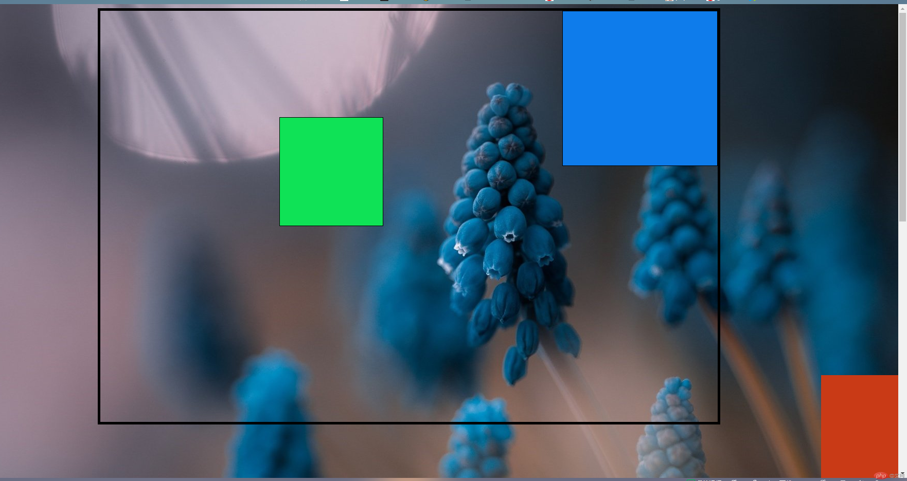