
1. 实例演示绝对定位与固定定位,并描述联系与区别 2. 实例演示flex必会的容器与项目属性
绝对定位
绝对: position: absolute, 相对距离最近的定位元素发生偏移
宽度自动收缩到内容宽度, 释放所占空间,后面顶上去,但是还在父容器中
li 定位元素
li ul 不是定位元素
li ul body 非定位
html 非定位
所有祖先都不是可定位元素,没有参考物了,就得找一个默认的,视口或html
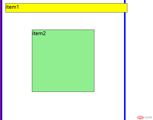
<!DOCTYPE html><html lang="zh-CN"><head><meta charset="UTF-8" /><meta http-equiv="X-UA-Compatible" content="IE=edge" /><meta name="viewport" content="width=device-width, initial-scale=1.0" /><title>相对定位,绝对定位</title></head><body><ul><li class="relative">item1</li><li class="absolute">item2</li><!-- <li style="background: green">item3</li> --></ul><style>/* 初始化 */* {margin: 0;padding: 0;box-sizing: border-box;}body {border: 5px solid red;}/* 基本样式 */ul {width: 400px;height: 400px;border: 5px solid blue;}ul li {height: 30px;border: 1px solid #000;list-style: none;}ul li:first-child {background-color: yellow;}ul li:first-child + * {background-color: lightgreen;}/* 相对定位 */ul li.relative {/* 转为"可定位元素" */position: relative;top: 10px;left: 10px;/* item2没有向上偏移,说明 item1 还在文档流中,所占空间没有释放 */}/* 绝对定位 */ul li.absolute {/* 定位元素 */position: absolute;/* 宽度自动收缩到内容宽度, 释放所占空间,后面顶上去,但是还在父容器中 *//* top: 40pxitem1.height(28+2) + ul.border(5) + body.border(5) = 40pxleft: 10pxul.border(5) + body.border(5) = 10px*/top: 100px;left: 100px;width: auto;height: auto;right: 200px;bottom: 100px;/* 宽度受限, 高度受内容伸展的空间进行布局 *//* 水平居中非常容易,但垂直极困难 */top: 0;left: 0;right: 0;bottom: 0;width: 200px;height: 200px;margin: auto auto;}/* li 定位元素 *//* li ul 不是定位元素 *//* li ul body 非定位 *//* html 非定位 *//* 所有祖先都不是可定位元素,没有参考物了,就得找一个默认的,视口或html */ul {/* 将 li 的包容器,转为定位元素 */position: relative;}</style></body></html>
固定定位
固定: position: fixed, 总相对于最初包含块(html)偏移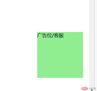
<!DOCTYPE html><html lang="zh-CN"><head><meta charset="UTF-8" /><meta http-equiv="X-UA-Compatible" content="IE=edge" /><meta name="viewport" content="width=device-width, initial-scale=1.0" /><title>固定定位</title></head><body><div class="box">广告位/客服</div><style>* {margin: 0;padding: 0;}.box {width: 150px;height: 150px;background-color: lightgreen;/* 固定定位 */position: fixed;/* top: 0;left: 0; *//* 右上角 *//* top: 0;right: 0; *//* 右下角 *//* left: 0;bottom: 0; *//* 右下角 */right: 20px;bottom: 50px;}body {min-height: 2000px;}</style></body></html>
绝对定位与固定定位的区别在 绝对: position: absolute, 相对距离最近的定位元素发生偏移,而固定: position: fixed, 总相对于最初包含块(html)偏移。
flex属性
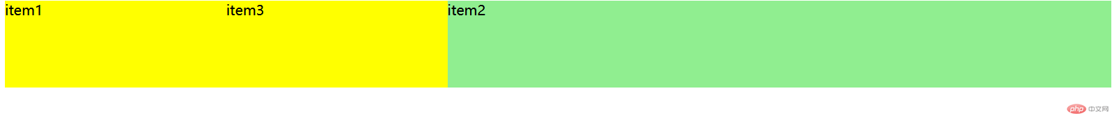
<!DOCTYPE html><html lang="zh-CN"><head><meta charset="UTF-8" /><meta http-equiv="X-UA-Compatible" content="IE=edge" /><meta name="viewport" content="width=device-width, initial-scale=1.0" /><title>flex属性</title></head><body><div class="container"><div class="item">item1</div><div class="item">item2</div><div class="item">item3</div></div><style>/* flex容器 */.container {/* width: 450px; */height: 100px;/* 使用flex进行布局,先将它转为flex容器元素 */display: flex;/* display: inline-flex; *//* 容器属性,必须写到容器元素中 .container *//* 主轴方向 *//* flex-direction: row;默认是水平行的方向flex-wrap: nowrap; 默认是不换行 wrap是换行*//* flex-flow: flex-direction flex-wrap; 合并属性*/flex-flow: row nowrap;/* 为了与后面的Grid布局属性对应 *//* `place-content`: 项目在"主轴"上的排列方式 */place-content: start;/* place-content: start;默认是左边排列 *//* place-content: end; 右边排列*//* 实际上, 主轴上的项目,可以独立进行排列 *//* 二端对齐 *//* place-content: space-between; *//* 分散对齐 两边空间两倍*//* place-content: space-around; *//* 平均对齐 两边空间重叠*//* place-content: space-evenly; *//* place-items: 项目在"交叉轴"上的排列方式 *//* place-items: stretch;默认值place-items: start;顶部对齐place-items: end;底部对齐place-items: center;居中对齐 */}/* flex容器中的子元素,就是flex项目 */.container > .item {background-color: lightgreen;/* height: 50px; *//* width: 150px;width: 250px; *//* 1. flex: 放大比例 允许收缩 主轴空间 *//* 默认,0不放大,1但可以自动收缩 */flex: 0 1 auto;/* flex: initial;默认值 *//* 2. 完全响应式,允许放大和自动收缩 */flex: 1 1 auto;/* flex: auto; *//* 完全不响应 */flex: 0 0 auto;/* flex: none; *//* 常用 */flex: 1;/* 等价于,后面二个值取默认值 1 auto */flex: 1 1 auto;flex: 1; /* flex: auto */}/* :first-child第一个 *//* :last-child最后一个 */.container .item:first-child,.container .item:last-child {background-color: yellow;flex: 1;}/* 中间占据三份 两边各占一份 */.container .item:first-child + * {flex: 3;/* place-self: start;顶部对齐 交叉轴上对齐方式 */}/* 默认每个项目的order = 0 *//* 越小越靠前 */.container .item:first-child {order: 5;}.container .item:first-child + * {order: 6;}.container .item:first-child {order: 7;order: -1;}</style></body></html>