

 Web Front-endCSS TutorialTake a look at these front-end interview questions to help you master high-frequency knowledge points (5)
Take a look at these front-end interview questions to help you master high-frequency knowledge points (5)


10 questions every day, after 100 days, you will have mastered all the high-frequency knowledge points of front-end interviews, come on! ! ! , while reading the article, I hope you don’t look at the answer directly, but first think about whether you know it, and if so, what is your answer? Think about it and then compare it with the answer. Would it be better? Of course, if you have a better answer than mine, please leave a message in the comment area and discuss the beauty of technology together.
Interviewer: How to achieve a fixed 300px layout on the left side and adaptive layout on the right side using css?
Me: Uh~, okay, you can use flex layout or floating BFC. The entire code is as follows:
flex Layout:
<style>
  *{margin: 0;padding: 0;}
  .container{
    display: flex;
  }
  .left{
    width: 300px;
    height: 100vh;
    background-color: #f00;
  }
  .main{
    flex: 1;
    background-color: #ae5aca;
  }
</style>

  <div>
    <div></div>
    <div></div>
  </div>
Floating BFC:
<style>
  *{margin: 0;padding: 0;}
  .container {
    height: 100vh;
  }
  .left {
    float: left;
    width: 300px;
    height: 100%;
    background-color: #f00;
  }
  .main {
    height: 100%;
    background-color: #ae5aca;
    overflow: hidden;
  }
</style>

  <div>
    <div></div>
    <div></div>
  </div>

Interview Official: What is the difference between align-content and align-items in flex layout?
Me: Uh~, they are all elements that act on the vertical axis. The specific differences are as follows:
##align-content: Acts on multi-line elements on the vertical axis, but does not work on one-line elements. [Related recommendations: web front-end development]
<style>
  .container {
    background-color: #efefef;
    border: 1px solid #888;
    margin-top: 3rem;
    height: 300px;
    display: flex;
    flex-wrap: wrap;
    /* 纵轴多元素一起居中 */
    align-content: center;
  }
  .item {
    width: 200px;
    height: 100px;
    background-color: #ccc;
    border: 1px solid #aaa;
  }
</style>

  <div>
    <div>1</div>
    <div>2</div>
    <div>3</div>
    <div>4</div>
    <div>5</div>
    <div>6</div>
    <div>7</div>
    <div></div>
    <div></div>
    <div></div>
  </div>

align-items: Acts on the vertical axis Single row element
<style>
  .container {
    background-color: #efefef;
    border: 1px solid #888;
    margin-top: 3rem;
    height: 300px;
    display: flex;
    flex-wrap: wrap;
    /* 纵轴单元素居中 */
    align-items: center;
  }
  .item {
    width: 200px;
    height: 100px;
    background-color: #ccc;
    border: 1px solid #aaa;
  }
</style>

  <div>
    <div>1</div>
    <div>2</div>
    <div>3</div>
    <div>4</div>
    <div>5</div>
    <div>6</div>
    <div>7</div>
    <div></div>
    <div></div>
    <div></div>
  </div>

Interviewer: What are the advantages of Grid layout?
Me: Uh~, Flex layout is an axis layout. You can only specify the position of the "item" against the axis. It can be regarded as a one-dimensional layout. Grid layout divides the container into "rows" and "columns", generates cells, and then specifies the cell where the "item is located", which can be regarded as a two-dimensional layout. Grid layout is far more powerful than Flex layout.
Interviewer: What is the difference between flex-basis and width in Flex layout?
Me: Uh~, the value of flex-basis is an ideal situation, but it may be compressed in actual situations. When flex-direction is column, the main axis is the vertical axis. At this time The correspondence between flex-basis and height
Interviewer: Will css loading block the parsing and rendering of the DOM tree?
Me: Uh~, css loading will directly affect the rendering of the web page, because only after the css is loaded and the CSSOM is built, the rendering tree (Render Tree) will be built and then rendered into Bitmap, if there is a script loaded in the html, it will also indirectly affect the parsing of the DOM tree, because the downloading, parsing and execution of javascript blocks the parsing of the DOM tree, and it is possible to access CSSOM in javascript, such as Element.getBoundingClientRect, so CSSOM The execution of javascript will not start until the construction is completed, indirectly blocking the parsing of the dom tree.
Interviewer: What is stacking context (stacking context), talk about your understanding of it
Me: Uh~, okay, A cascading context is a three-dimensional representation of these HTML elements. HTML elements occupy this space in order of priority based on their element attributes. The priority is as follows:If you want to know more about the stacking context: Recommended article:
In-depth understanding of the stacking context and stacking order in CSS.

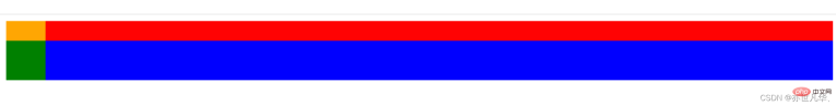
面试官:z-index: 999 元素一定会置于 z-index: 0 元素之上吗?
我:呃~,不会,我们在进行层叠上下文时,会优先比较父级,如果父级是层叠上下文,子级即使有z-index也不再起作用了,如果父级层叠上下文层叠顺序相等,那么采取后来居上原则,前者覆盖后者。如果父级是普通元素,子级层叠比较就不受父级的影响,谁的层叠顺序高谁就先展示。
层叠黄金准则:
谁大谁上:当具有明显的层叠水平标示的时候,如识别的z-indx值,在同一个层叠上下文领域,层叠水平值大的那一个覆盖小的那一个。通俗讲就是官大的压死官小的。
后来居上:当元素的层叠水平一致、层叠顺序相同的时候,在DOM流中处于后面的元素会覆盖前面的元素。
整出代码如下:
<style>
  .first {
    background-color: red;
    height: 3rem;
    z-index: 2;
    opacity: 0.99;
  }
  .item1 {
    z-index: 0;
    height: 100%;
    width: 3rem;
    background-color: orange;
  }

  .second {
    background-color: blue;
    height: 3rem;
    margin-top: -1.5rem;
    z-index: 3;
    position: relative;
  }
  .item2 {
    z-index: 999;
    height: 100%;
    width: 3rem;
    background-color: green;
  }
</style>

  <div>
    <div></div>
  </div>
  <div>
    <div></div>
  </div>
面试官:什么是 Data URL?
我:呃~,Data URL 是将图片转换为 base64 直接嵌入到了网页中。
使用
这种方式引用图片,不需要再发请求获取图片。
使用 Data URL 也有一些缺点:
base64 编码后的图片会比原来的体积大三分之一左右。
Data URL 形式的图片不会缓存下来,每次访问页面都要被下载一次。可以将 Data URL 写入到 CSS 文件中随着 CSS 被缓存下来。
面试官:网站设置字体时,如何设置优先使用系统默认字体?
我:呃~,system-ui 将会自动选取系统默认字体作为字体。

面试官:CSS如何实现圣杯布局?
我:呃~,圣杯布局是指两端宽度固定,中间自适应。在日常开发中,圣杯布局的使用频率是比较高的。举一个简单的浮动例子,当然也可以使用定位或flex布局,整出代码如下:
浮动:
nbsp;html>


        <meta>
        <style>
            * {
                margin: 0;
                padding: 0;
            }
            .container {
                border: 1px solid black;
                overflow: hidden;
                padding: 0px 100px;
                min-width: 100px;
            }
            .left {
                background-color: greenyellow;
                float: left;
                width: 100px;
                margin-left: -100%;
                position: relative;
                left: -100px;
            }
            .center {
                background-color: darkorange;
                float: left;
                width: 100%;
            }
            .right {
                background-color: darkgreen;
                float: left;
                width: 100px;
                margin-left: -100px;
                position: relative;
                left: 100px;
            }
        </style>


    	<section>
            <article><br><br><br></article>
            <article><br><br><br></article>
            <article><br><br><br></article>
        </section>

The above is the detailed content of Take a look at these front-end interview questions to help you master high-frequency knowledge points (5). For more information, please follow other related articles on the PHP Chinese website!

 @keyframes vs CSS Transitions: What is the difference?May 14, 2025 am 12:01 AM
@keyframesandCSSTransitionsdifferincomplexity:@keyframesallowsfordetailedanimationsequences,whileCSSTransitionshandlesimplestatechanges.UseCSSTransitionsforhovereffectslikebuttoncolorchanges,and@keyframesforintricateanimationslikerotatingspinners.
 Using Pages CMS for Static Site Content ManagementMay 13, 2025 am 09:24 AM
I know, I know: there are a ton of content management system options available, and while I've tested several, none have really been the one, y'know? Weird pricing models, difficult customization, some even end up becoming a whole &
 The Ultimate Guide to Linking CSS Files in HTMLMay 13, 2025 am 12:02 AM
Linking CSS files to HTML can be achieved by using elements in part of HTML. 1) Use tags to link local CSS files. 2) Multiple CSS files can be implemented by adding multiple tags. 3) External CSS files use absolute URL links, such as. 4) Ensure the correct use of file paths and CSS file loading order, and optimize performance can use CSS preprocessor to merge files.
 CSS Flexbox vs Grid: a comprehensive reviewMay 12, 2025 am 12:01 AM
Choosing Flexbox or Grid depends on the layout requirements: 1) Flexbox is suitable for one-dimensional layouts, such as navigation bar; 2) Grid is suitable for two-dimensional layouts, such as magazine layouts. The two can be used in the project to improve the layout effect.
 How to Include CSS Files: Methods and Best PracticesMay 11, 2025 am 12:02 AM
The best way to include CSS files is to use tags to introduce external CSS files in the HTML part. 1. Use tags to introduce external CSS files, such as. 2. For small adjustments, inline CSS can be used, but should be used with caution. 3. Large projects can use CSS preprocessors such as Sass or Less to import other CSS files through @import. 4. For performance, CSS files should be merged and CDN should be used, and compressed using tools such as CSSNano.
 Flexbox vs Grid: should I learn them both?May 10, 2025 am 12:01 AM
Yes,youshouldlearnbothFlexboxandGrid.1)Flexboxisidealforone-dimensional,flexiblelayoutslikenavigationmenus.2)Gridexcelsintwo-dimensional,complexdesignssuchasmagazinelayouts.3)Combiningbothenhanceslayoutflexibilityandresponsiveness,allowingforstructur
 Orbital Mechanics (or How I Optimized a CSS Keyframes Animation)May 09, 2025 am 09:57 AM
What does it look like to refactor your own code? John Rhea picks apart an old CSS animation he wrote and walks through the thought process of optimizing it.
 CSS Animations: Is it hard to create them?May 09, 2025 am 12:03 AM
CSSanimationsarenotinherentlyhardbutrequirepracticeandunderstandingofCSSpropertiesandtimingfunctions.1)Startwithsimpleanimationslikescalingabuttononhoverusingkeyframes.2)Useeasingfunctionslikecubic-bezierfornaturaleffects,suchasabounceanimation.3)For


Hot AI Tools

Undresser.AI Undress
AI-powered app for creating realistic nude photos

AI Clothes Remover
Online AI tool for removing clothes from photos.

Undress AI Tool
Undress images for free

Clothoff.io
AI clothes remover

Video Face Swap
Swap faces in any video effortlessly with our completely free AI face swap tool!

Hot Article
Hot Tools

Notepad++7.3.1
Easy-to-use and free code editor

SecLists
SecLists is the ultimate security tester's companion. It is a collection of various types of lists that are frequently used during security assessments, all in one place. SecLists helps make security testing more efficient and productive by conveniently providing all the lists a security tester might need. List types include usernames, passwords, URLs, fuzzing payloads, sensitive data patterns, web shells, and more. The tester can simply pull this repository onto a new test machine and he will have access to every type of list he needs.

MantisBT
Mantis is an easy-to-deploy web-based defect tracking tool designed to aid in product defect tracking. It requires PHP, MySQL and a web server. Check out our demo and hosting services.

ZendStudio 13.5.1 Mac
Powerful PHP integrated development environment

SublimeText3 Chinese version
Chinese version, very easy to use

