flex项目上的三个属性
1.项目的缩放比例与基准宽度
flex属性用法及演示:
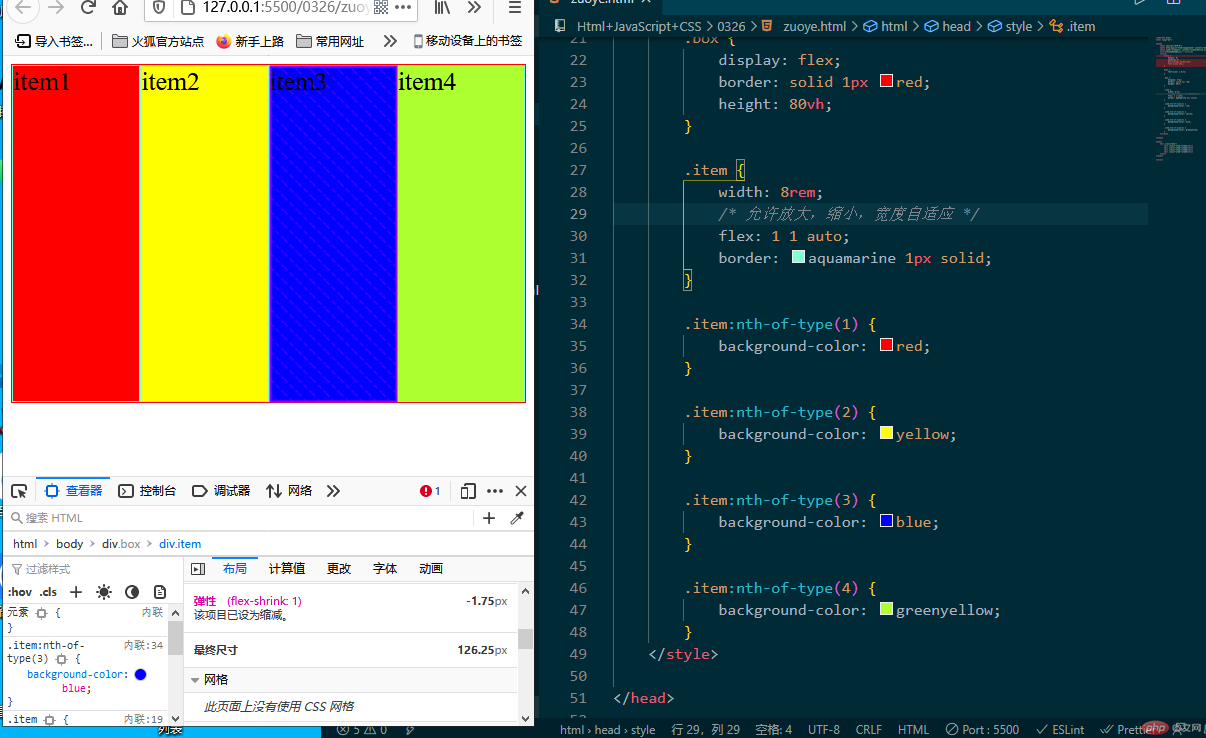
<!DOCTYPE html><html lang="en"><head><meta charset="UTF-8"><meta http-equiv="X-UA-Compatible" content="IE=edge"><meta name="viewport" content="width=device-width, initial-scale=1.0"><title>Flex项目的三个属性</title><style>root: {margin: 0;padding: 0;box-sizing: border-box;font-size: 10px;}body {font-size: 1.6rem;}.box {display: flex;border: solid 1px red;height: 80vh;}.item {width: 8rem;/* 允许放大,缩小,宽度自适应 */flex: 1 1 auto;border: aquamarine 1px solid;}.item:nth-of-type(1) {background-color: red;}.item:nth-of-type(2) {background-color: yellow;}.item:nth-of-type(3) {background-color: blue;}.item:nth-of-type(4) {background-color: greenyellow;}</style></head><body><div class="box"><div class="item">item1</div><div class="item">item2</div><div class="item">item3</div><div class="item">item4</div></div></body></html>
2.单个项目在交叉轴上的对齐方式
align-self属性用法及演示:
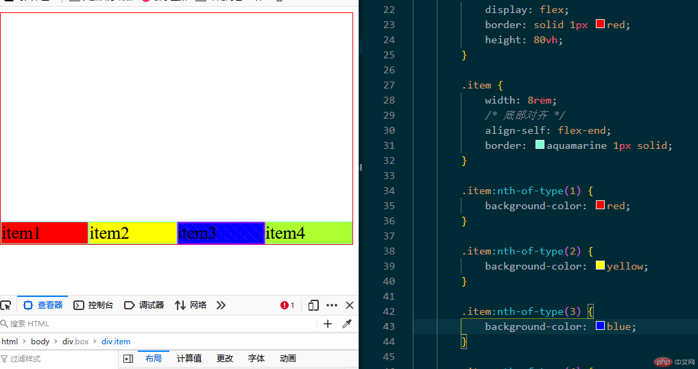
<!DOCTYPE html><html lang="en"><head><meta charset="UTF-8"><meta http-equiv="X-UA-Compatible" content="IE=edge"><meta name="viewport" content="width=device-width, initial-scale=1.0"><title>Flex项目的三个属性</title><style>root: {margin: 0;padding: 0;box-sizing: border-box;font-size: 10px;}body {font-size: 1.6rem;}.box {display: flex;border: solid 1px red;height: 80vh;/* 主轴垂直不换行 *//* flex-flow: column nowrap; */}.item {width: 8rem;/* 底部对齐 */align-self: flex-end;border: aquamarine 1px solid;}.item:nth-of-type(1) {background-color: red;}.item:nth-of-type(2) {background-color: yellow;}.item:nth-of-type(3) {background-color: blue;}.item:nth-of-type(4) {background-color: greenyellow;}</style></head><body><div class="box"><div class="item">item1</div><div class="item">item2</div><div class="item">item3</div><div class="item">item4</div></div></body></html>
3.项目在主轴上排列顺序
order属性用法及演示:
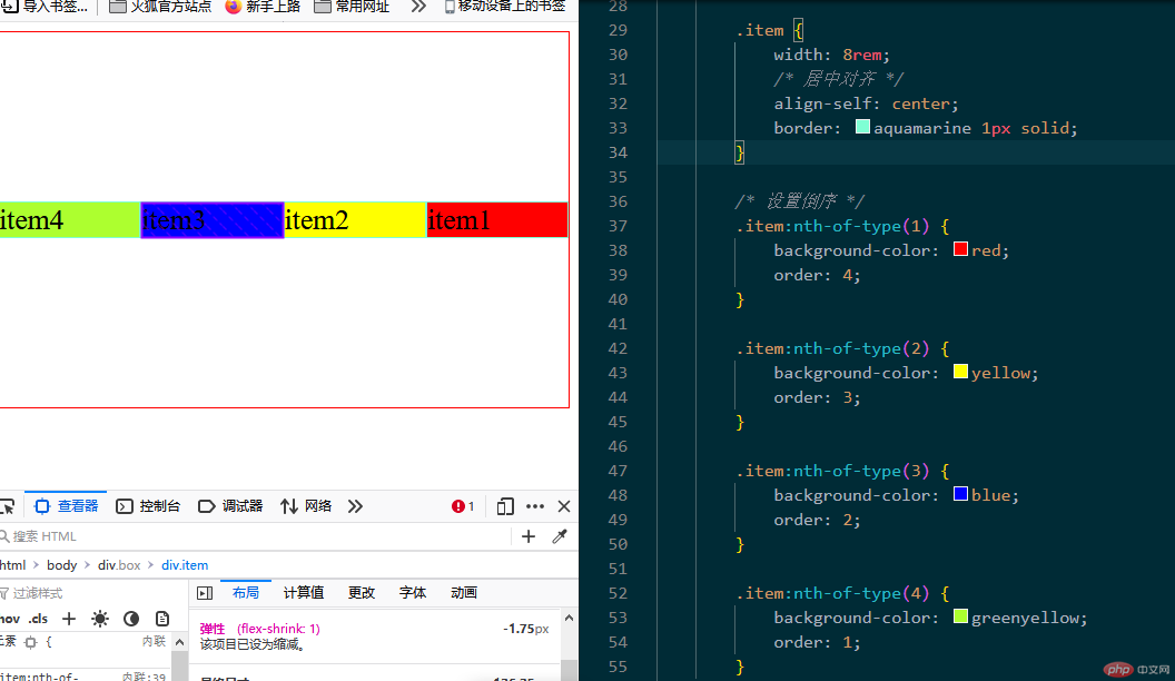
<!DOCTYPE html><html lang="en"><head><meta charset="UTF-8"><meta http-equiv="X-UA-Compatible" content="IE=edge"><meta name="viewport" content="width=device-width, initial-scale=1.0"><title>Flex项目的三个属性</title><style>root: {margin: 0;padding: 0;box-sizing: border-box;font-size: 10px;}body {font-size: 1.6rem;}.box {display: flex;border: solid 1px red;height: 80vh;/* 主轴垂直不换行 *//* flex-flow: column nowrap; */}.item {width: 8rem;/* 居中对齐 */align-self: center;border: aquamarine 1px solid;}/* 设置倒序 */.item:nth-of-type(1) {background-color: red;order: 4;}.item:nth-of-type(2) {background-color: yellow;order: 3;}.item:nth-of-type(3) {background-color: blue;order: 2;}.item:nth-of-type(4) {background-color: greenyellow;order: 1;}</style></head><body><div class="box"><div class="item">item1</div><div class="item">item2</div><div class="item">item3</div><div class="item">item4</div></div></body></html>
移动商城首页的页眉和页脚的布局
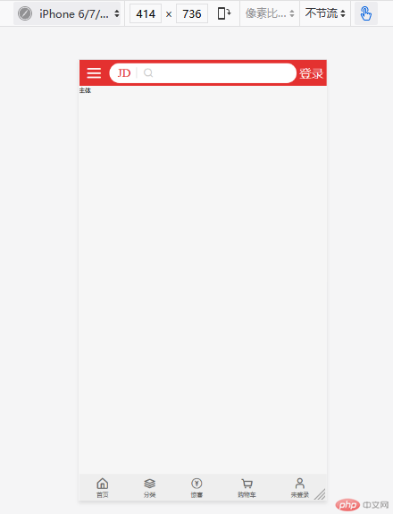
<!DOCTYPE html><html lang="en"><head><meta charset="UTF-8"><meta http-equiv="X-UA-Compatible" content="IE=edge"><meta name="viewport" content="width=device-width, initial-scale=1.0"><title>Document</title><link rel="stylesheet" href="static/css/index.css"><link rel="stylesheet" href="static/icon-font/iconfont.css"><link rel="stylesheet" href="static/css/header.css"><link rel="stylesheet" href="static/css/footer.css"></head><body><!-- 页眉 --><div class="header"><!-- 菜单 --><div class="menu iconfont icon-menu"></div><!-- 搜索框 --><div class="search"><div class="logo">JD</div><div class="zoom iconfont icon-search"></div><input type="text" class="words" value="移动硬盘500G"></div><!-- 登录按钮 --><a href="" class="login">登录</a></div><div class="main">主体</div><div class="footer"><div><div class="iconfont icon-home"></div><span>首页</span></div><div><div class="iconfont icon-layers"></div><span>分类</span></div><div><div class="iconfont icon-Group-"></div><span>惊喜</span></div><div><div class="iconfont icon-shopping-cart"></div><span>购物车</span></div><div><div class="iconfont icon-user"></div><span>未登录</span></div></div></body></html>